


One of the most powerful tools in an architect’s arsenal is colour. The use of colour combinations in architecture can transform spaces, influence moods, and even affect how we perceive the size and shape of buildings.
In this blog, we will explore the significance of colour combinations in architecture and how they contribute to the functionality and aesthetics of built environments.
The Psychological Impact of Colour.
Colours have a profound impact on our psychological state. Different colours can evoke various emotions and reactions:
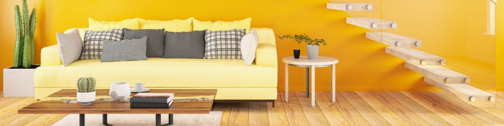
– Warm Colours (Red, Orange, Yellow): These colours are often associated with energy, warmth, and comfort. They can make large spaces feel more intimate and inviting.
– Cool Colours (Blue, Green, Purple): These hues tend to have a calming effect and can make smaller spaces feel more expansive and serene.

– Neutral Colours (White, Grey, Beige): Neutral tones offer a sense of balance and sophistication. They serve as excellent backdrops, allowing other design elements to stand out.
Understanding the psychological effects of colours helps architects design spaces that meet the intended emotional responses and functional requirements.
Optimising Space and Functionality
Colour combinations can significantly influence how a space is perceived and used. When used thoughtfully, colour can transform a building’s environment, impact occupant behaviour, and enhance the overall experience of a space.

Spatial Perception: Light colours can make small spaces appear larger and more open, while dark colours can make large spaces feel cosier and more intimate. For instance, a narrow hallway can be made to feel wider with the use of light, cool colours.
Functional Zoning: Different colours can be used to define areas within a space, guiding users through the environment intuitively. For example, in a large open-plan office, colour zoning can delineate workspaces, meeting areas, and break zones without the need for physical barriers.
Cultural and Contextual Considerations
Colours carry different meanings and connotations in various cultures and contexts. An effective architectural design respects and reflects these cultural nuances.
Cultural Significance: In some cultures, certain colours are imbued with specific meanings. For example, red is often associated with good luck in Chinese culture, while it might signify warning or danger in others.
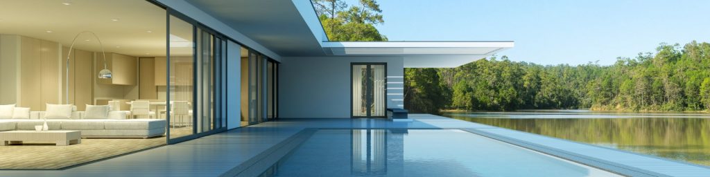
Environmental Context: The surrounding environment should influence colour choices. Buildings in a natural, rural setting might use earthy tones to blend seamlessly with the landscape, whereas urban structures might employ bold, vibrant colours to stand out amidst the concrete jungle.
Enhancing Aesthetic Appeal
Beyond functionality, colour combinations are crucial for the aesthetic appeal of architectural designs.

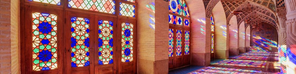
Harmony and Contrast: Achieving a balance between harmonious colour schemes and contrasting elements can create visually stunning results. Complementary colors (colors opposite each other on the colour wheel) can add vibrancy and energy, while analogous colours (colours next to each other on the colour wheel) can offer a more subtle and cohesive look.
Highlighting Architectural Features: Strategic use of colour can highlight specific architectural features, such as accentuating the height of a building or drawing attention to a unique design element. This can enhance the overall visual interest and appreciation of the structure.
Sustainability and Colour
Energy Efficiency: Light-coloured roofs and walls can reflect more sunlight, reducing cooling costs and energy consumption. Similarly, darker colours can help absorb heat in colder climates, aiding in passive heating.
Eco-friendly Materials: Choosing paints and finishes that are low in volatile organic compounds (VOCs) and other harmful substances can contribute to a healthier indoor environment and reduce the ecological footprint of a building.
Conclusion
The strategic use of colour combinations in architecture is crucial. Colours influence psychological responses, enhance functionality, respect cultural contexts, and boost aesthetic appeal. By effectively using colours, architects create spaces that are beautiful, engaging, functional, and sustainable. As architectural design evolves, the thoughtful application of colour remains essential in shaping our built environment.
If you enjoyed our article about Colour Combinations, take a look at our News section to see more.
Fewer Harrington & Partners is an Irish Architects Practice with offices in Waterford, Dublin and across the world.
Keep up with the latest updates by following us on LinkedIn. See our project portfolio here, or get in touch below:


